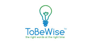
Sometimes, clever isn’t as wise as simple. I originally thought that it was clever and humble (wise is humble, right?) to use all lower case for the logo. Feedback told me otherwise (no pun intended). Some people said “Who is Tobe? Toby?” A good friend suggested the embedded capital letters, or to insert spaces between the words, and I defended it by saying “Can’t you figure it out?” His reply was right between the eyes: “Yes, of course, but I shouldn’t have to!.” Can’t argue with that. Here’s the way it was, and the new, improved version. Less clever, more clear. Thank you George Walther for your clarity of thought, and Thank You, Rob Bertholf for your magic with the new logo. I love continuous improvement!


